Data Observability on AWS for Modern Data Platforms: The Complete Picture
Part 1: Understanding the Problem and Exploring the Solutions

This is the first article in a three-part (or maybe more) series on building data observability on AWS for modern data platforms. Over the course of this series, we'll explore three different approaches to implementing comprehensive data quality monitoring, comparing their architectures, costs, performance characteristics, and scalability limits.

In this first part, we'll establish the foundations by explaining what data observability is, why it matters, and how it differs from traditional infrastructure monitoring. We'll give a recap of the five pillars of data quality and demonstrate a complete do-it-yourself implementation on AWS. You'll get production-ready code and a clear understanding of when this approach makes sense and where it hits its limits.
The second part will examine AWS Glue Data Quality, Amazon's fully managed solution built on the same Deequ framework we'll discuss in the third part. We'll analyze the trade-offs between ease of use and cost, exploring when a managed service justifies its premium pricing and when it becomes prohibitively expensive at scale.
In the third and final part, we'll explore self-managed Deequ running on Spark clusters via EMR, Glue ETL or even a self-managed Spark cluster. This middle-ground approach offers the performance and scalability of distributed computing while maintaining the flexibility and cost-efficiency that managed services can't match. We'll see how this often represents the sweet spot for medium to large-scale data platforms.
By the end of this series, you'll have a comprehensive understanding of all three approaches, complete with working code, cost breakdowns, and assessments of when to use each one. Whether you're building your first data quality monitoring system or scaling an existing platform, you'll have the knowledge to make an informed architectural decision based on your specific context.
Part 1: Problem Statement the DIY Approach
Section 1: Setting the Context (Problem Statement)
1.1 The 3 AM Wake-Up Call
It’s 3 AM on a Tuesday.
You’re part of a data platform team at a public health organization, responsible for aggregating vaccination data from multiple national and international sources. Your dashboards are used daily by executives, policymakers, and external partners to track vaccination progress and make strategic decisions.
Your VP of Analytics is staring at a dashboard showing vaccination rates exceeding 100% across several business lines. The executive team made strategic decisions based on these numbers six hours ago.
Everything looks good in your data platform monitoring stack (e.g. Prometheus dashboards, Grafana metrics, CloudWatch alarms).
Your data pipelines are running perfectly on schedule.
But your data is completely broken, and nobody knew.
The Cost of This Blind Spot
According to a Gartner’s research (a bit outdated but still relevant), poor data quality costs organizations an average of $12.9 million per year. But the real impact goes beyond dollars:
Direct costs: Engineering time firefighting data issues: incident response and root cause analysis, Data pipeline reruns and backfills.
Indirect costs: Wrong business decisions based on bad data: customers losing trust when dashboards show incorrect metrics, regulatory issues from inaccurate reporting, opportunity cost when time is spent debugging instead of building features.
Human cost: Burnout from constant firefighting, loss of credibility with stakeholders, team morale impact when everything is on fire.
How Problems Are Discovered Today
Monte Carlo’s 2023 survey of data professionals revealed a troubling pattern: 74% reported that business stakeholders (not monitoring systems) identify data quality issues first, "all or most of the time.”
When issues are detected, resolution takes an average of 15 hours, with most teams spending 4+ hours just on detection. This reactive approach, where users effectively become the data quality monitoring system, remains one of the industry’s most persistent operational challenges.
This is backwards. Users should never be your data quality monitoring system.
1.2 The Observability Blind Spot
What Traditional Monitoring Sees
Traditional infrastructure monitoring is very good at what it was designed to do: tracking the health of the platform.
It tells you whether your infrastructure is up, whether pipelines are running on time, whether jobs are failing, and whether resources are available to process workloads efficiently.
Now consider this scenario.
An upstream API introduces a seemingly minor change: a field called country_code switches from a 3-letter format (USA) to a 2-letter format (US).
Your data pipeline keeps running without errors.
But a join condition like:
ON raw.country_code = dim.country_codenow fails silently.
Instead of producing 50,000+ rows, the join returns zero. No alerts fire, no jobs fail, everything appears green.
Meanwhile, your downstream dashboards are completely wrong.
Traditional monitoring says that everything is fine, but the reality says: Your data is broken.
The Core Issue
Traditional observability focuses on the pipes.
It answers questions like: Did the job run? Did it fail? Was it slow?
Data observability focuses on what flows through those pipes.
It answers questions like: Does this data still make sense? Is it complete? Is it consistent with expectations?
And that’s the blind spot: your infrastructure can be perfectly healthy while the data it produces is quietly unusable.
1.3 The Two Layers of Data Platform Observability
To really understand what’s happening in a data platform, you need 360° observability. That means looking at both sides of the system at the same time: the technical foundation and the data itself.
The first layer is technical observability. This is the part most teams are already familiar with. It focuses on whether the platform is running correctly: are the systems up, are jobs executing on time, are queries performing within acceptable limits, are containers and services healthy, and is the network behaving as expected?
Tools like Prometheus, Grafana, CloudWatch, Datadog, or New Relic are very good at answering these questions. They tell you whether the machinery is working.
But that’s only half of the picture.
The second layer is data observability. Instead of asking “Did the pipeline run?”, it asks “Did it produce meaningful data?”
This layer looks at whether the data is fresh, whether the expected amount of data is actually there, whether schemas have changed unexpectedly, whether values still fall within reasonable ranges, and how changes upstream affect everything downstream. In other words, it focuses on the correctness and trustworthiness of what flows through the system.
You need both layers at once: a platform can look perfectly healthy from a technical standpoint while quietly delivering incorrect or misleading data.
360° observability is about making sure that when the system says “everything is fine,” the data also makes sense.
The Unified Dashboard
The magic happens when you combine both layers in a single view.
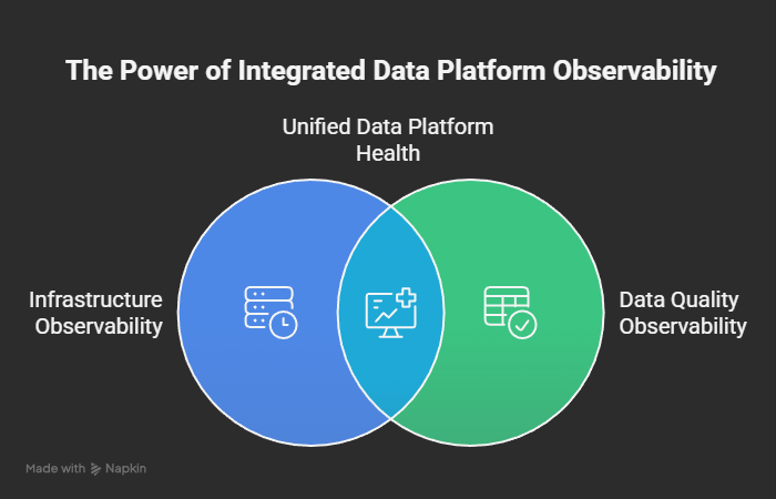
When both layers are green, you can trust your data. When either is red, you know exactly where to look.
1.4 The Five Pillars of Data Observability
Data observability is about continuously validating that your data remains trustworthy as it moves through your platform.
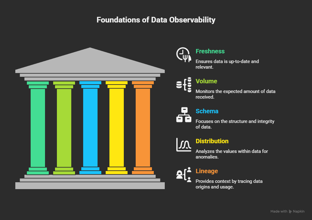
Over time, the data observability community has converged on five core dimensions, often called the five pillars of data observability. Together, they define what “healthy data” really means and what should be monitored from a data quality perspective.
Pillar 1: Freshness
Freshness answers a simple question: how up to date is your data?
Data that arrives late is often worse than no data at all, because it creates the illusion of correctness. Decisions are made, dashboards are consulted, and automated actions are triggered under the assumption that the information reflects the current state of the world.
Imagine a table containing daily vaccination numbers that is expected to update every morning. If the latest data is still from yesterday afternoon, nothing is technically broken (pipelines ran, queries succeeded, but the data is already stale). Analysts may draw conclusions that are no longer valid, and “real-time” dashboards quietly drift out of sync with reality.
Freshness monitoring ensures that data arrives when it is expected.
Pillar 2: Volume
Volume looks at whether you are receiving the right amount of data.
Most datasets have a natural rhythm: a certain number of rows per hour, per day, or per batch. When that volume suddenly drops or spikes, it is usually a strong signal that something has gone wrong upstream.
For example, if a dataset normally receives around 50,000 records per day and suddenly only 3,000 arrive, the pipeline may still complete successfully, but large portions of the data are missing. Conversely, unexpected spikes can indicate duplicates, retries, or ingestion bugs.
Volume monitoring catches these silent failures before they turn into misleading metrics.
Pillar 3: Schema
Schema observability focuses on the structure of your data.
Column names, data types, and nullability are often assumed to be stable, but in reality they change frequently, especially when data comes from external systems or fast-moving product teams.
A renamed column or a subtle type change can break joins, dashboards, and machine learning pipelines without producing obvious errors. A query may still run, but return empty or incorrect results.
Monitoring schema changes helps detect these breaking shifts early, before they cascade across downstream systems and teams.
Pillar 4: Distribution
Distribution answers the question: do the values in your data still make sense?
Even when data is fresh, complete, and structurally correct, the actual values may be wrong. Business logic errors, faulty transformations, or upstream bugs can introduce impossible or highly suspicious values.
For instance, a vaccination rate expressed as a percentage should logically fall between 0 and 100. Values outside that range are a clear signal that something is broken, even if everything else looks normal.
Distribution monitoring helps surface anomalies, outliers, and invalid values that traditional checks will never catch.
Pillar 5: Lineage
Lineage provides context. It tells you where data comes from and where it is used.
When a data issue is detected, lineage allows you to quickly understand the blast radius: which tables depend on the broken dataset, which dashboards will be affected, which teams need to be informed, and which business decisions may be impacted.
Without lineage, teams spend valuable time manually tracing dependencies during incidents. With it, you can prioritize fixes, communicate proactively, and prevent small issues from becoming major outages.
Together, these five pillars shift observability from “did the pipeline run?” to “can we trust the data?”.
They are the foundation of modern data quality monitoring, and the difference between a platform that merely functions and one that reliably supports business decisions.
Section 2: Three Approaches to Implementation
2.1 A Spectrum of Solutions
Now that we understand what data observability is and why it matters, the next question is obvious: how do you actually implement it?
In practice, there is no single right solution. Teams naturally end up at different points on a spectrum, shaped by data volume, team skills, budget, and how much control they want over the system.
In this series, we’ll explore three distinct approaches to implementing data observability on AWS, each representing a different trade-off between simplicity, flexibility, and scale.
At a high level:
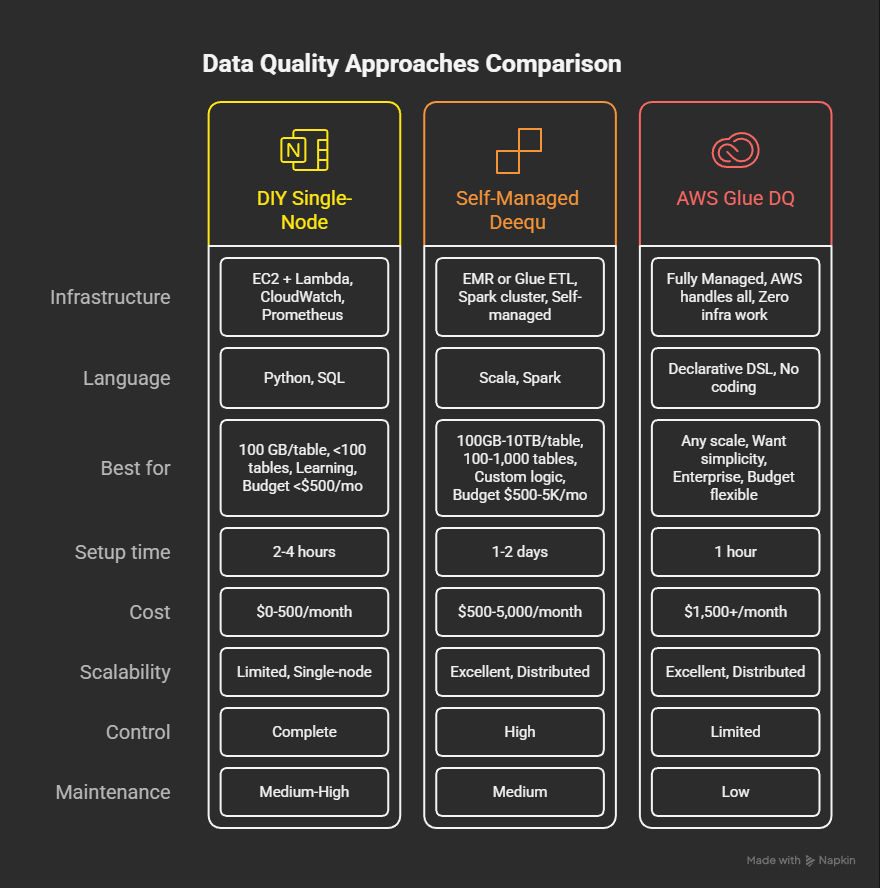
Approach 1: DIY, single-node
A lightweight, do-it-yourself setup using simple compute, with data quality checks implemented in Python and executed via AWS Lambda. This approach is well suited for small datasets, learning, and early proof-of-concepts.
Approach 2: Self-managed, distributed (Deequ / Spark)
A more scalable, engineering-driven approach where data quality checks run on distributed compute using Spark and Deequ. It offers a strong balance between flexibility, performance, and cost at medium to large scale, at the expense of higher operational responsibility.
Approach 3: Fully managed (AWS Glue Data Quality)
A fully managed service where infrastructure, orchestration, and execution are handled by AWS Glue. It still relies on Deequ under the hood, but prioritizes speed of adoption and operational simplicity over fine-grained control, with a higher cost profile.
These approaches are not competitors in the abstract.
They address different needs at different stages of data platform maturity, and the best choice depends entirely on context.
2.2 How We’ll Compare Them
We’ll evaluate each approach through three practical lenses.
Performance
How quickly can data quality checks run as data volumes grow?
Can the solution handle hundreds of gigabytes or even terabytes, without becoming a bottleneck?
How fast can issues be detected once something goes wrong?
Scalability
How far can this approach go before it starts to break down?
Does it scale smoothly with data volume, number of tables, and team size, or does it eventually require a redesign?
Cost
Not just infrastructure costs, but also engineering time, operational overhead, and how expenses evolve as you scale.
Something that is cheap to start is not always cheap to operate long-term.
The goal is not to crown a universal winner, but to make the trade-offs explicit.
There is no “best” approach, only the best approach for your specific context.
Conclusion
Data observability is no longer optional, it’s the safety net that keeps modern data platforms trustworthy. Even when infrastructure looks healthy, your data can be stale, incomplete, or silently broken. Observability ensures you catch these issues before they impact decisions, dashboards, or ML models.
As we’ve seen, there is no single “best” approach. Teams must balance simplicity, control, cost, and scale:
DIY, single-node – lightweight, full control, ideal for small datasets or learning.
Self-managed, distributed (Deequ / Spark) – flexible and performant at medium-to-large scale, but requires engineering ownership.
Fully managed (AWS Glue Data Quality) – fastest to adopt and easy to operate, with less control and higher cost.
The goal is to understand the trade-offs and pick the approach that fits your team and your data context.
What’s Next
In the next article, we’ll take a deep dive into the DIY approach, showing how a small-scale, single-node proof of concept can monitor data quality across all five pillars. You’ll see how to set up the architecture, implement data quality checks, visualize results, and measure performance.
For those eager to get started right away, the complete DIY PoC is available on GitHub:
https://github.com/tttao/aws-data-observability-poc
This hands-on walkthrough will give you a tangible starting point, and set the stage for exploring more scalable approaches in later articles.